Tuesday, 20 March 2012

My Music Magazine Double Page Spread Flat Plan


I have designed two flat plans for my double page spread for my music magazine. My first flat plan has been designed so that it will contain a masthead, a banner at the top and the bottom of the page, a main image for the double page spread, a dateline, text and angled text and also page numbers in both of the pages bottom corners. I have positioned the features of the double page spread in a way which I think looks best and will look good and attractive to the reader and I think it will be a good layout to the final outcome of the magazine.

My second design contains the same features as my first design, but on my second design I have positioned the features in different locations among the double page spread. My main image like my first flat plan does not cover the entire page, it only covers where it is indicated on my flat plan.

The flat plan I will be using is my second design, this is because I prefer the layout and I think it will make my overall magazine look better and make it interesting for the readers. I like the way the main text/article will be positioned  on the left hand side of the page and with a few quotations positioned in different positions on the double page spread


My Music Magazine Contents Page Flat Plans


I have created two flat plan ideas for my music magazine contents page, I have designed them in a way in which I want my contents page to look to the reader. My first design contains a masthead with the magazine's logo, a main image which is located on the left of the design, a contents list on the right, sub-banner and three smaller images that are placed on an angle.

My second design is completely different to my first design as the contents list is at the bottom of the page. I have included four smaller images and a sub-story. The masthead is located in the middle of the page unlike the top like the others.
When I make my contents page I will use my first design. This is because I like the design more based on the positioning of the contents page features. I think overall it will look better as a music magazine contents page than my second design which I think looks to plain and not eye-catching.

Friday, 16 March 2012

My Music Magazine Front Cover Flat Plans


I have created two flat plans of front covers for my music magazine. The flat plan that I am going to use for my actual magazine is the one on the left. The reason for this is that I think the layout of the page works better for a music magazine and looks less serious and more creative than the other flat plan. I like the layout of this because of the positioning the various presentational features. The main headline on a certain angle, I like that it is on on angle because it looks less serious and less formal to the reader, a banner across the top with the masthead and dateline below. I also like the three pugs in the top right hand corner and they will be used as incentives and lures for my magazine. The main image takes up the entire page which I like because it will stand out to the reader. I have included a support story, barcode and issue number at the bottom of the page, I positioned this in that way because it is of less importance as a support story would not be at the top.

Wednesday, 14 March 2012

Typography


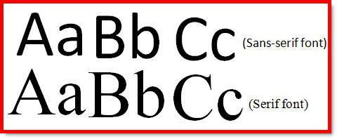
When I create my music magazine I will need to chose a style of typography. I will be using a Serif Font in my magazine. I will use this because I think it looks more professional and also a neater style of text. The difference between San-Serif Font and Serif font is that Sans-Serif style is more rounded than a Serif font. What makes a Serif font a Serif font? At the end of a letter there are Serifs which makes the typography look more professional and for this text now I am using a Serif Font.

Tuesday, 13 March 2012

How My Music Magazine Questionnaire Results Has Effected The Choices I Will Make In My Music Magazine

After analyzing my music magazine questionnaire results I will use these results to influence me in what I am going to include within my own magazine. The age range of the people buying music magazine is 16-18. I have found out that the three most popular styles of music from my questionnaire in ascending order are, Rock, Pop Punk and Alternative. I have also found out what kind of camera shot the audience prefer on a music magazine front cover, I found out that the audience like a posed shot on the front cover. These results from my music magazine questionnaire will influence me with the creation of my music magazine.